Table of Contents
Description
The MITK chart module is able to show different types of charts in a widget with customizable labels.
Technical background
The module uses the java script library plotly to display the chart in a QWebEngineView (that renders html/js content).
For examples, please visit https://plot.ly/javascript/.
GUI
- Note
- Be sure that the dependency to the Chart Module is resolved in the CMakeLists.txt of the plugin:
MODULE_DEPENDS MitkChart.
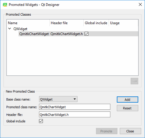
Open the ui file of the plugin. Then add a widget (we always use the name chartWidget in the following) at the desired position. Change the class of the widget to a user-defined widget (right click → user defined classes, see https://doc.qt.io/qt-6/designer-using-custom-widgets.html). Set "QWidget" as base class. Set "QmitkChartWidget" as class name and "QmitkChartWidget.h" as include file.
Data
The most important functionality is to add data to the chartWidget. Either one dimensional or two dimensional data can be used. One-dimensional data has the same interval between values on the x-axis (and no x-axis values) while the two-dimensional data has arbitrary x-axis difference values (and given x-axis values).
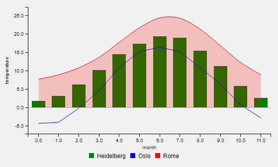
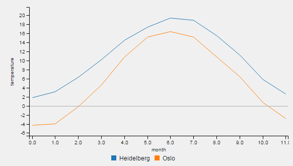
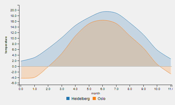
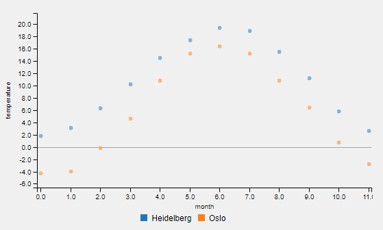
An example for one-dimensional data is the temperature for each month of a year: std::vector<double> temperatureHD = {1.8, 3.1, 6.3, 10.2, 14.5, 17.4, 19.4, 18.9, 15.5, 11.2, 5.8, 2.6}. The first entry corresponds (implicitly) to the temperature in january, two second to the temperature in february the last entry to the temperature in december. Thus, the x values have same intervals. The given temperature values are defined as y-axis values.
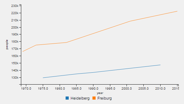
An example for two-dimensional data is the people living in a city in different years: std::map<double,double> peopleHeidelberg={{1975, 129368 }, { 1985, 134724 },{ 1990, 136796 },{ 2010, 147312 }}.
Thus, the x-values are given as their intervals are different (10 years, 5 years, 10 years). Each x value is connected to an y-value that represents the amount of people (1975 → 129368, 1985 → 134724, ...).
Data is added by calling chartWidget->AddData1D(temperatureHD, "Heidelberg") or chartWidget->AddData2D(peopleHeidelberg, "Heidelberg"), where the second argument is a label for the data entry.
As the data labels are used as identifier, they have to be unique. This is checked. If non-unique entries are entered, they are made unique by adding numbers. Example:
will result in the labels "Heidelberg" and "Heidelberg0", whereas "Heidelberg0" refers to temperatureOslo.
If you want to add more data, just call chartWidget->AddData1D(data, label, chartType) or chartWidget->AddData2D(data, label, chartType) as often as desired. Then, call chartWidget->Show(). The ranges of x- and y-axis are adjusted automatically.
To delete single data entries, call chartWidget->RemoveData(label) and update the chart area with chartWidget->Show(). All data can be cleared by calling chartWidget->Clear().
Chart type
The default chart type is bar. To use a different type, you have to change it.
Seven chart types are available:
-
bar -
line -
spline -
pie -
are -
area_spline -
scatter
See below examples of all types:
Call e.g. chartWidget->SetChartType(label, QmitkChartWidget::ChartType::line) for changing the chart type. Note that it is not directly displayed. To change the chart type for all data entries and display the result, call chartWidget->SetChartTypeForAllDataAndReload(QmitkChartWidget::ChartType::line).
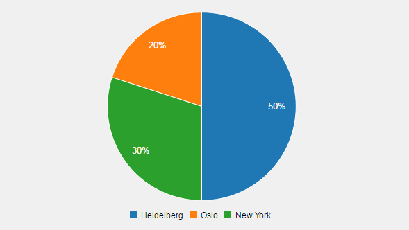
All chart types except pie chart can be also used mixed (different chart types in the same chart). Pie charts are handled differently. The input data sum is regarded as 100%. The values of all data entries are summed. Example:
The pie chart has then entries of 50%, 20% and 30%. Calling chartWidget->AddData1D({5,2,3}, "entry", QmitkChartWidget::ChartType::pie) leads to a pie chart with one class having 100%. Calling
leads to the first result again (50%, 20% and 30%) as entries are summed.
- Warning
- pie charts differ significantly from the other chart types. Be aware of the differences.
Labels
Four labels can be set to custom strings. These are
- the data labels,
- the x-axis label,
- the y-axis label and
- the title of the chart
Data labels provide the name for data legend entries ("Heidelberg" for our 1D data Data as it is the average temperature in Heidelberg) and are given by the second argument of AddData1D and AddData2D. They are also displayed in the legend. An example x-Axis and y-axis label would be month and temperature, respectively.
The data label argument is mandatory. All other labels are optional and empty strings by default.
chartWidget->SetXAxisLabel("month") and chartWidget->SetYAxisLabel("temperature") ensures the labeling of x- and y-Axis in the chart. No labels are defined as default.
chartWidget->SetTitle("temperature chart") adds a title to the chart.
- Note
- The legend position (of data labels) can be set by
chartWidget->SetLegendPosition(QmitkChartWidget::LegendPosition::bottom). -
To hide the legend, call
chartWidget->SetShowLegend(false).
Displaying the chart
Finally, the chart is displayed by calling chartWidget->Show(bool). If the optional parameter is set to true, a subchart is shown additionally. That's useful for ensuring the overview if the user wants to zoom in.
Changing visualization attributes of data
Besides the chart type, the following attributes of a data entry can be changed:
- color,
- linesyle and
- data points shown
this is done by referencing the data entry by its label (e.g. "Heidelberg" above): chartWidget->SetColor("Heidelberg", "green"), chartWidget->SetColor("Heidelberg", "#FF4500"), chartWidget->SetLineStyle("Heidelberg", LineStyle::dashed) and chartWidget->SetShowDataPoints(false).
- Note
- SetShowDataPoints is a global attribute and valid for all data entries due to technical reasons.
Colors are chosen automatically by plotly if not given. However, if some data entries have given colors and some have not, same colors may appear for different data entries. Color can be given as strings (natural names like red or hexadecimal numbers like #FF0000 . For color selection, the following reference is helpful: https://www.w3schools.com/cssref/css_colors.asp)
Line style only can be set if ChartType is QmitkChartWidget::ChartType::line. It is ignored otherwise. Also, if a non-existing label is given, the command is ignored. The default linestyle is LineStyle::solid.
Example
Bar chart
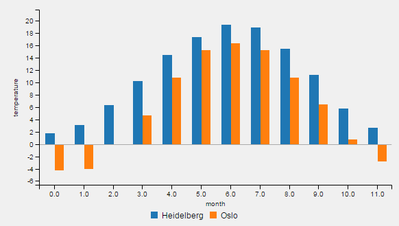
To create and visualize a bar chart with two data sets, x/y-axis labels and data labels, the following code is used:
The order when AddData1D() is called influences the colors of the bars and the order of the shown data. The third argument of chartWidget->AddData1D() is superfluous and only for completeness as QmitkChartWidget::ChartType::bar is the default chart type. After Show() is called, the chart is visualized.
The chart type for all data entries can be changed to spline and directly showed:
the equivalent code is:
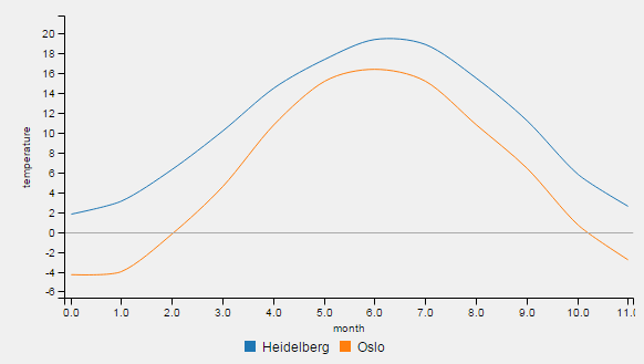
The temperature of another city can be added:
As Show(true) is used, a subchart is shown.
Pie chart
A pie chart (the same as in Chart type ) can be generated with the following code:
- Note
- Only one pie chart at a time can be displayed.
Mixed chart
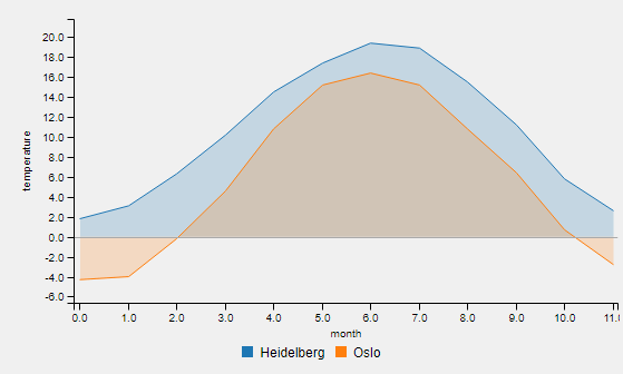
Chart types and attributes like colors and line styles can be mixed as seen in the code example below (example result is the chart in Description ):
- Note
- Pie chart as chart type is an exception. Pie charts can't be displayed with other data entries having other chart types.
Removing data
Data also can be removed again (using the previous example Mixed chart as base):
Only the date entries labeled "Oslo" remain.
Also all data can be removed:
The chart is empty now.
Chart with 2D data
A line chart with two-dimensional data is the following example (the same as in Data ):
Hence, 2D data is having the following assignment: year → people. In the vector peopleHD, four values are defined, in the vector peopleFreiburg, five values are defined. The defined years are different for Heidelberg (1975-2010) than for Freiburg (1969-2015).
- Warning
- mixing AddData2D and AddData1D in a chart is strongly discouraged. It will work, however the visualization may be odd due to implicit and explicit given x values.
image statistics plugin
An example of the use of QmitkChartWidget in MITK can be found in the image statistics plugin. The chartWidget is named m_Controls->m_JSHistogram there.