|
Medical Imaging Interaction Toolkit
2016.11.0
Medical Imaging Interaction Toolkit
|
|
Medical Imaging Interaction Toolkit
2016.11.0
Medical Imaging Interaction Toolkit
|
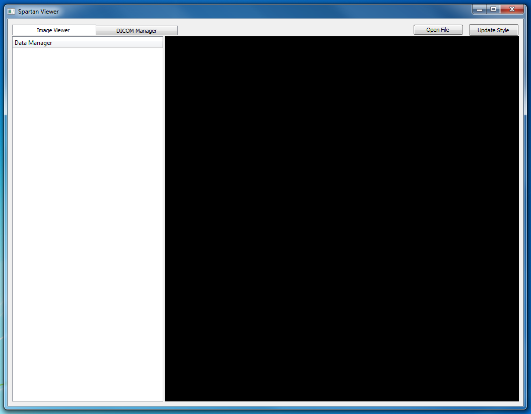
In a final step, we want to further customize the appearance of our mainWindow to give it an distinct non-native look and feel. We want to achieve this by pursuing the following aims:
For GUI customization, we will modify the Qt-Stylesheets files already used by blueberry applications. Within the Qt-Stylesheet-Files, all widgets can globally and locally be adressed inside the main window for style changes. We have to adress the berry::IQtStyleManager to tell the BlueBerry workbench to use a specific Qt-Stylesheet. This is done inside the WorkbenchAdvisor in the CustomViewerWorkbenchAdvisor::Initialize() method:
The style manager is taken from the application's plugin context via service reference. Invoking the berry::IQtStyleManager::AddStyle() and berry::IQtStyleManager::SetStyle() methods, the workbench will now use the announced qss-File to style our Workbench Window. In a production system, the stylesheets are usually compiled into the plug-in or application using the Qt resource system. However, during developement of the stylesheets it is often more convenient to reference them using a hard-coded path to the local file system (see live update functionality below).
Before we start customization we will first provide some customization convenience. We add an UpdateStyle()-slot to our CustomViewerWorkbenchWindowAdvisor where we explicitly reset the css-File to the style manager:
By integrating an update style button to the Application's main window and connecting this button with the previously defined slot, we can now button-push-update the style on runtime. This will of course only work for stylesheets which are referenced from the local file system.

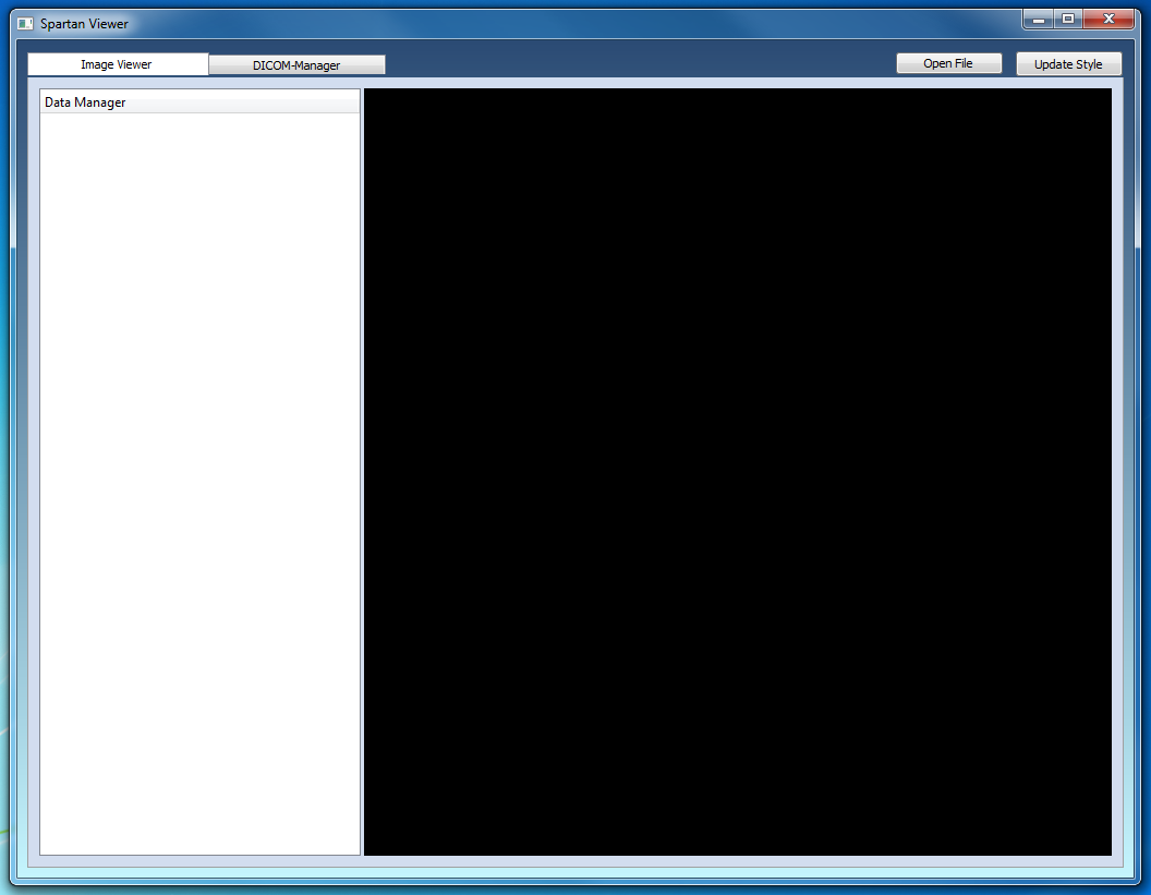
First we might want to change the background color style by setting the background color of the QWidget::CentralWidget to a linear gradient from light to dark blue:
Then, we give the page composite control widget a slight grey border (except for the upper border where no border should be visible) and the same background color as the activated tab widget:
The image below depicts the style changes.

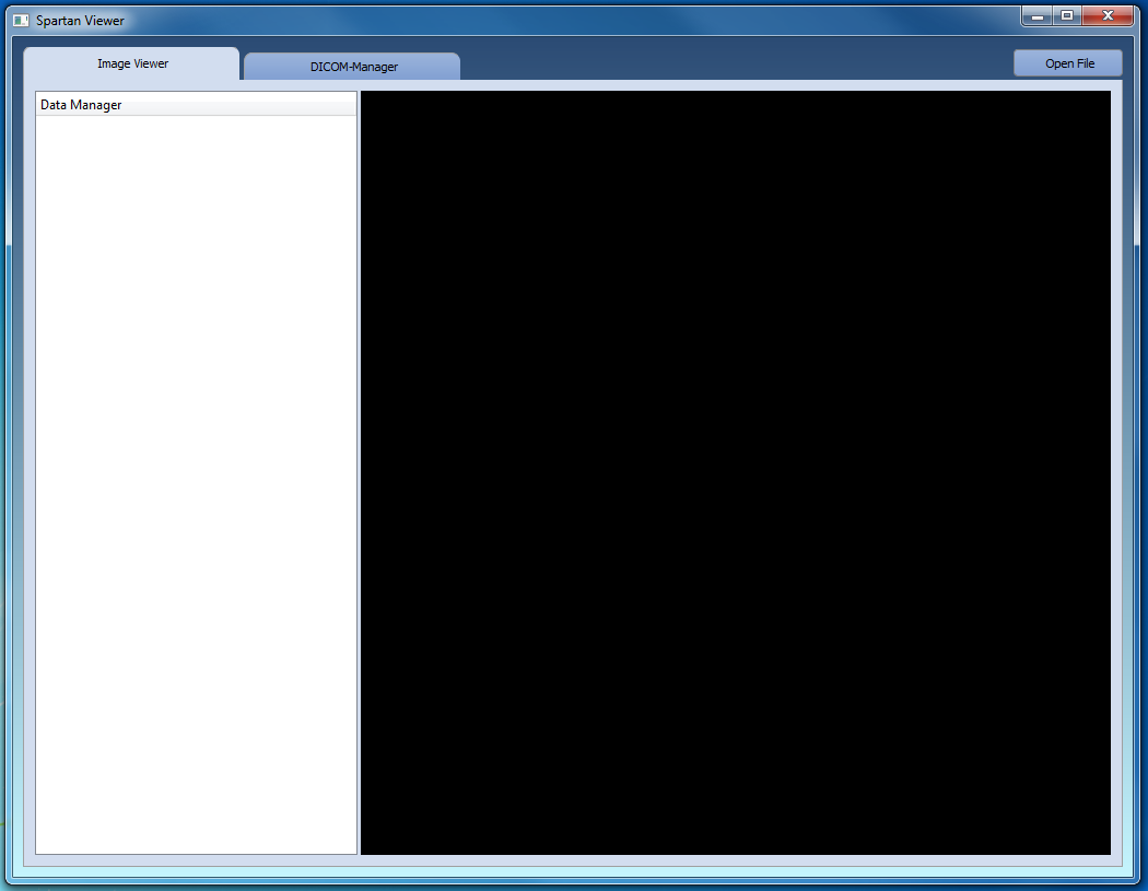
Concerning the tab-widget style, four states have to be customized: QtPerspectiveSwitcherTabBar::tab (the tab in general), QtPerspectiveSwitcherTabBar::tab:selected (when tab is selected), QtPerspectiveSwitcherTabBar::tab:selected:hover (when tab is selected and the mouse is hovering above), QtPerspectiveSwitcherTabBar::tab:!selected:hover (respectively).
All tabs are given round corners using border-top-left- and border-top-right-radius definitions. Additionally, all tabs is provided a gap to its neighbor defining a positive margin right. Selected tabs appear bigger by defining a negative upper margin, and they have no lower frame in the unselected state so a tab-widget appearance is provided. Finally, they have a brighter background color also used by the QWidget::ClientComposite. Hovering tabs are colored yellow and have a visible lower border:
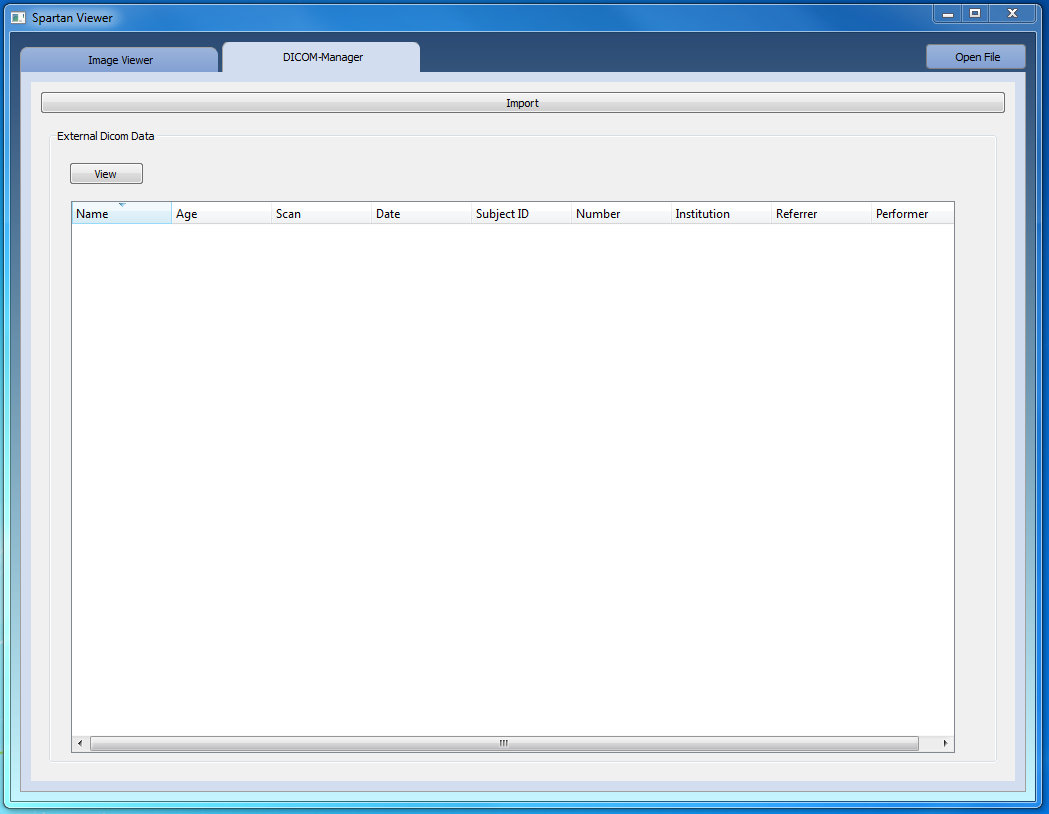
Finally, we customize the Push- and Tool-Buttons in a similar way:
The resulting style-customized main window is shown below (the style update button removed).


Proceed to the previous page Adding functionality: Data Manager, Render Window, File Opening and DICOM Import.